October 25, 2016
Today, we are very excited to announce the new look of Atlas Mapping.
The original 'Atlas A' has been with us since the beginning in 2011. Back then, a small team of three came together, sharing a single, well-organised desk in a small room at the back of our founder's house. Our logo was the product of three simple triangles overlaid on top of each other in powerpoint.
Fast-forward five years to the present and Atlas Mapping is now highly respected as the leading provider of territory mapping solutions for franchisors, both online and offline. Our team now works out of a modern, open-plan office and every day we take steps to improve our products and services.
With so many changes in five years, our brand needed a refresh to reflect better the Atlas Mapping of today and the direction in which we are moving. We asked Design Agency, the team behind our websites since we launched to help us.
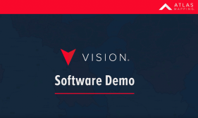
We wanted to retain red, but make it brighter to represent our energy. Red expresses our passion for what we do, and our strength to consistently improve our services. It had to be simple, to describe how hard we work to simplify things for our customers. And lastly, the new logo had to be ultra-modern, in line with our innovative approach to mapping, and the release of our latest solution Vision.
The result? Our 'Atlas A' is now simpler, the product of only two triangles, and the modern font and brighter red are more vibrant and captivating. These changes are our future, and yet, they maintain a strong connection to our history and how we are recognised.