
October 1, 2015
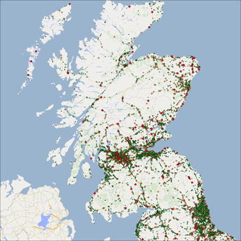
In this blog we’ve decided to take a look at public transport, using the dataset NaPTAN (National Public Transport Access Nodes) published by the Department for Transport, for more information on the data visit here and for licensing purposes go here. The points being displayed represent Airports, Bus stops, Ferries, Metro or Trams and Railways stations.
We’ve created a range of different images showing the amount and breakdown of transport types in different towns and cities, we’ve also created an eye-catching visualisation of the bus zones throughout the country.
Country level Statistics
Transport Type:
- Air – 84
- Bus – 419,222
- Ferry – 753
- Metro or Tram – 2,411
- Rail – 2,707
- Total – 425,177
The image above has been created to help provide a visualisation of just how many points there are throughout the country. The different shadings denote the different bus zones.
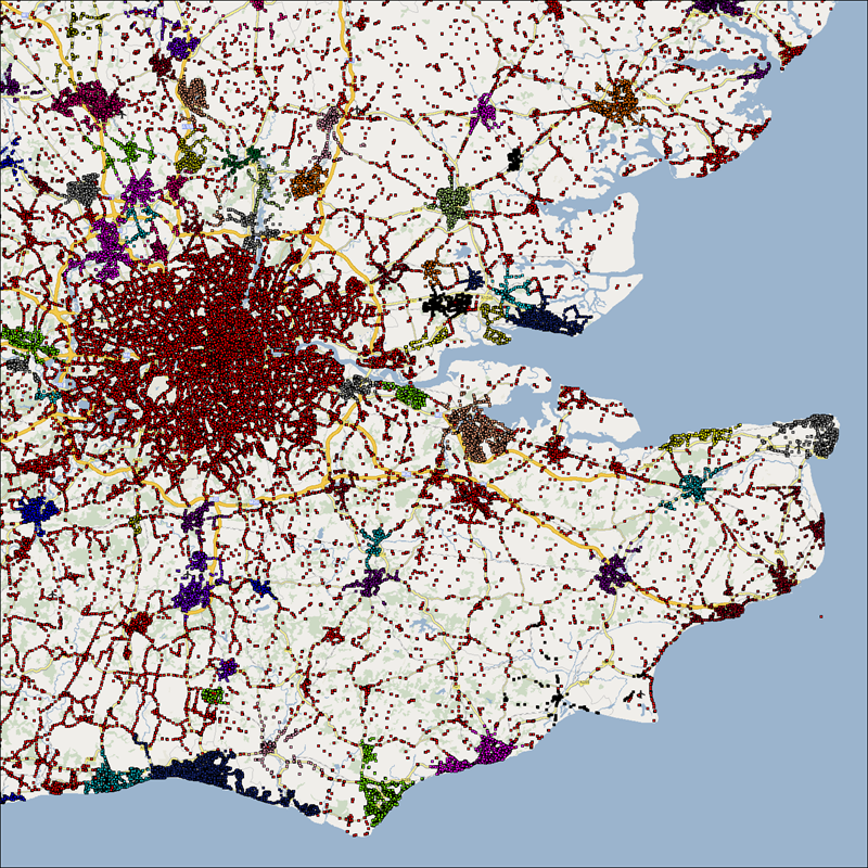
The images below take a closer look at a few locations to get an understanding of what their transport infrastructure looks like.
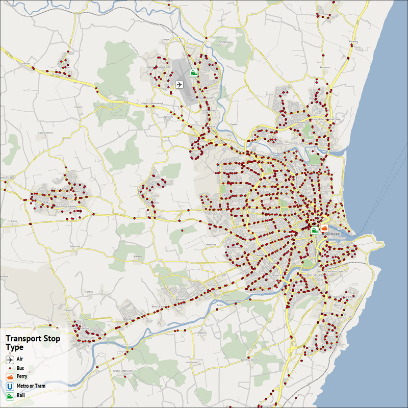
Aberdeen
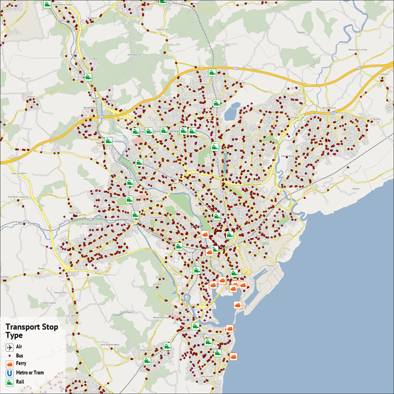
Cardiff
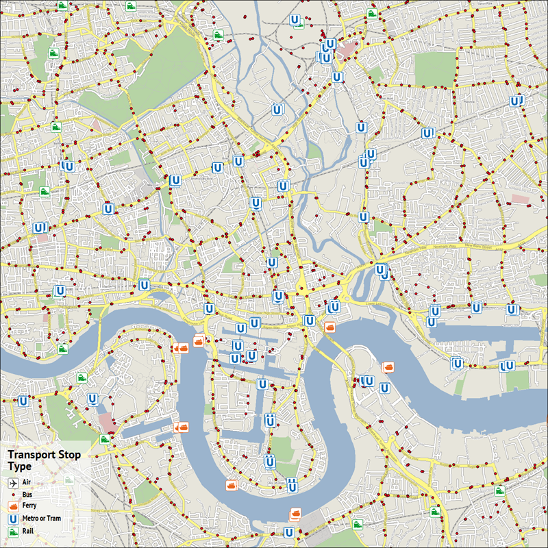
Isle of Dogs
Peterborough
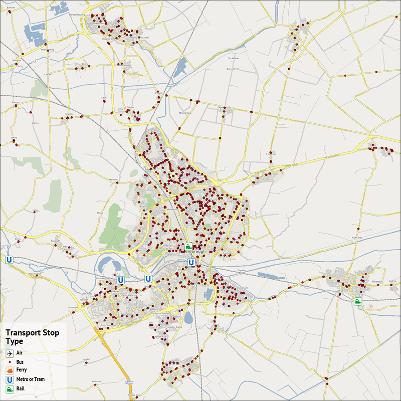
As we can see, the number and types of transport methods vary throughout each of the locations. It’s interesting to see just how extensive the bus routes are, and the different means of transport available at each location.
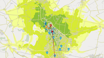
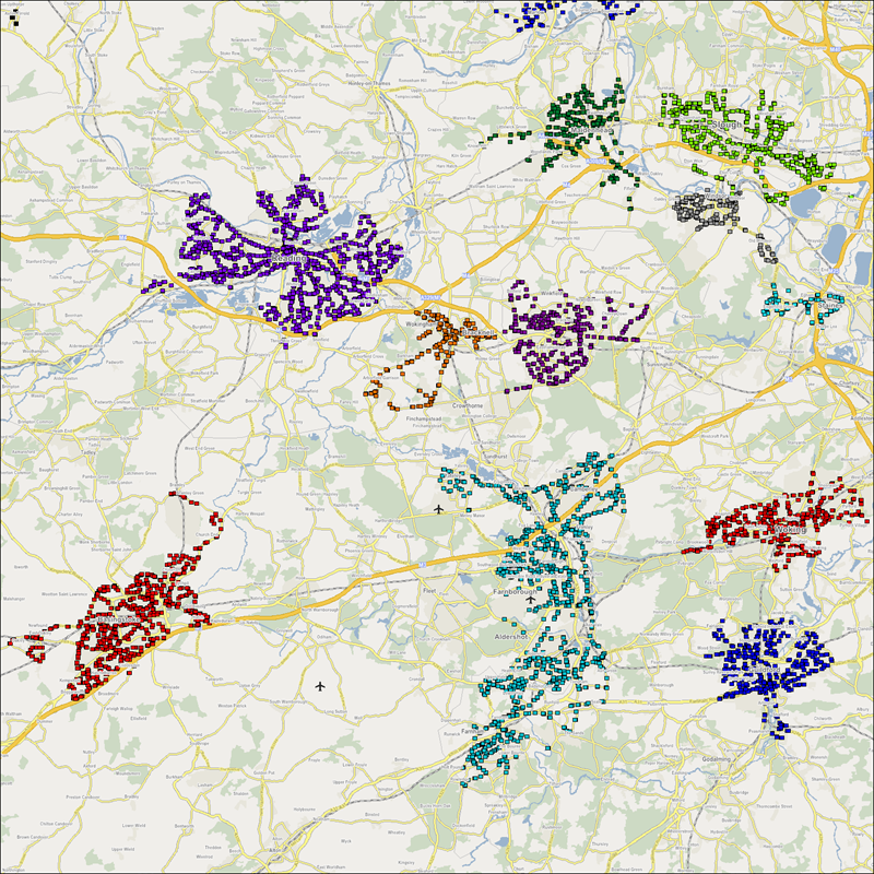
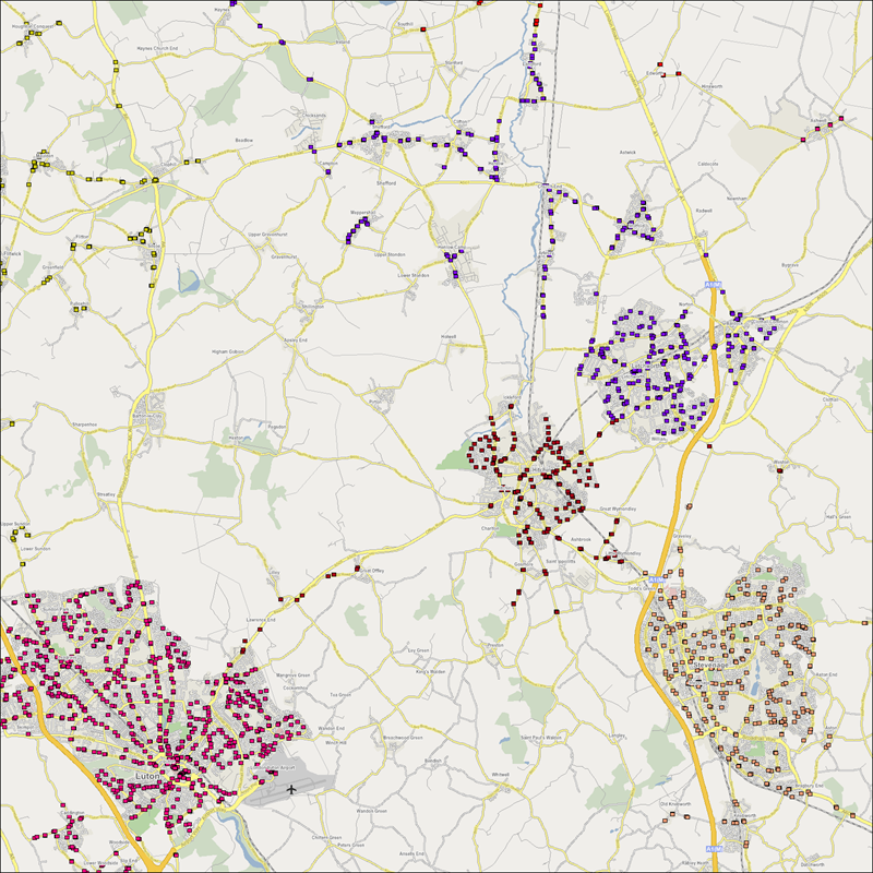
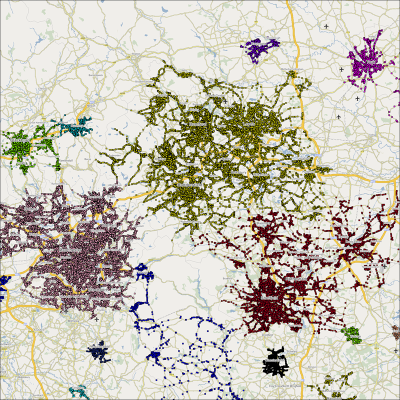
Bus Zones
The size and spread of different bus zones varies greatly throughout the country. The images below show the variance and what the different bus zones cover.
Example 1
Example 2
Example 3
Top 5 Largest Bus Zones
- MNCRPIC (Manchester) - 21,049 Stops
- LEEDS (Leeds) - 18,641 Stops
- BHAMNWS (Birmingham) - 15,147 Stops
- SHEFFLD (Sheffield) - 10,370 Stops
- GLGC (Glasgow) - 4,834 Stops